
Film posters have always played a key role in attracting audiences to the theatres. Even now, with straight to DVD releases and online streaming, artwork associated with a film can actually aide in deciding the fate of a moviegoers watch list and even contribute to the success of a film. Just think, a film might not even reach a genre fans playlist if the poster isn’t strong enough.
The poster art collection is one of the bulwarks of film fandom, with many sought after vintage poster memorabilia worth thousands of Pounds/Dollars and more. And, it’s a thriving business for some.
Growing up, besides from collecting posters of my favourite gangster rap groups and bands, the horror movie posters displayed in my local video store were something I looked forward to. Often a magnet for my weekender movie binge, I’d look at posters for guidance for the movies I’d be watching. Perhaps it’s why I rented the same movies, in that they subliminally influenced me to watch them repeatedly.
This week I’ve collated some of my favourite horror movie posters. I also asked some horror fan friends, and was happy to see that some were my chosen gems too.
I also had to be careful not to confuse myself with my favourite films, because although there are posters here that I like, it doesn’t necessarily mean they were my top films. But this is the beauty of the film poster, it lures us in, creating some great deception or lives up to its graphic and in most cases vivid illustration.
Making a film poster requires a lot of work and thought. I can relate to this when trying to devise ideas and communicate what I wanted for my film Newborn and my WIP film From Me To You, which still needs a film poster, a challenge I’m looking forward to!
But now for some posters!
Carl Ramsey – Poltergeist poster

Carl Ramsey was known for his special airbrush technique, and notable posters such as Beetlejuice and Return of the Living Dead. He also made album artwork for Alice Cooper and other bands. His website still stands, and although I couldn’t find any of his former poster works on there, there are some beautiful oil painting works which show just how varied his work was.
Drew Struzan – The Thing
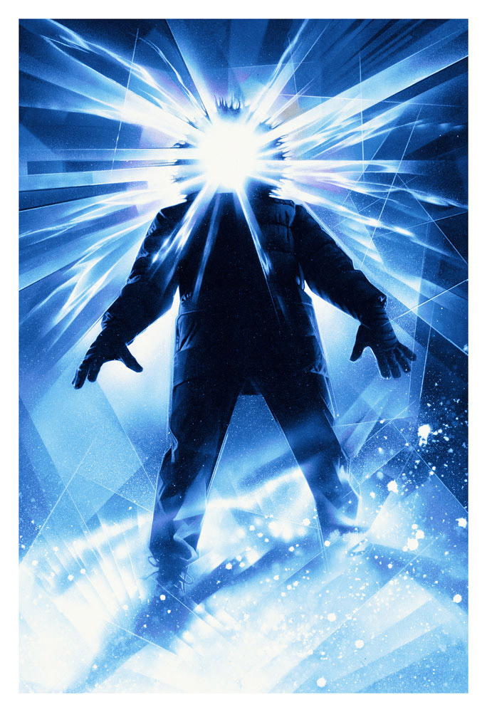
According to https://cameraviscera.com, Drew Struzan had a crash course by Carl Ramsey in airbrush painting. Yet another prolific artist, Struzan’s work is well-recognised from The Thing to E.T and Bladerunner and with a catalogue of over a hundred and fifty posters worth.
Apparently, The Thing Poster was created in one night and Struzan is known for turning over assignments rapidly. Also, it should be noted that all he was told was that the film was a remake of the 1953 film ‘The Thing that Came from Outer Space.’ Armed with this information, Struzan took a number of pictures of himself in cold weather attire and when found one he was happy with, used that as the basis for the poster.
Bill Gold – The Exorcist, Alien and The Wiz

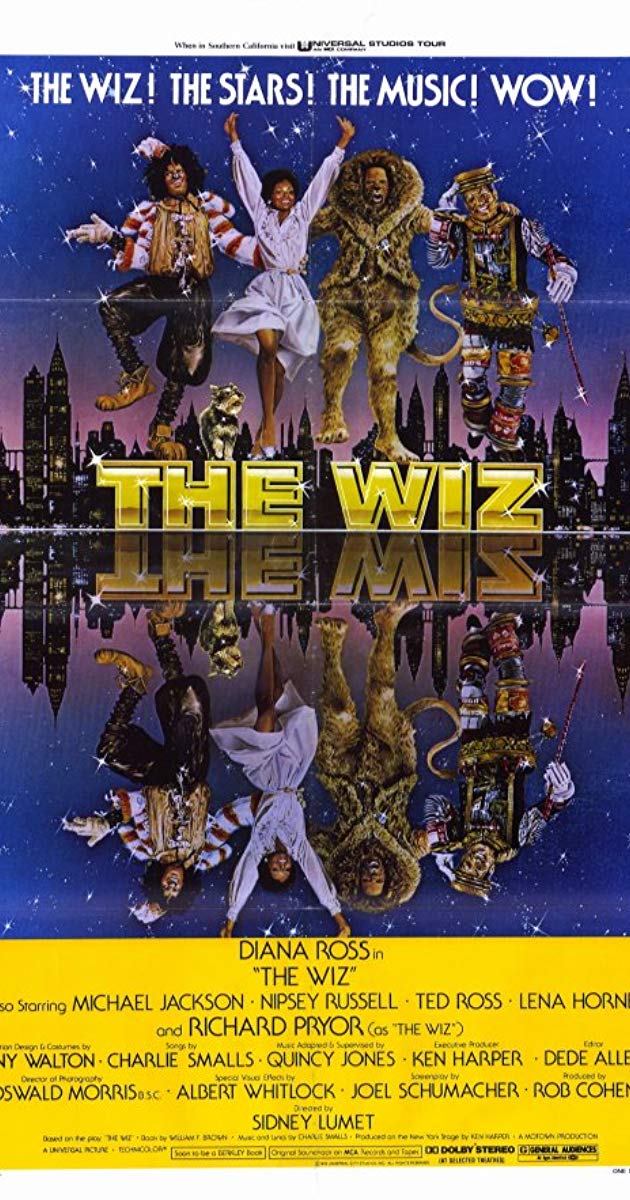
Bill Gold was a prolific graphic artist with a catalogue spanning thousands of posters. You just have to check Wikipedia and be blown away by the amount of work he produced.
It’s difficult to name the most notable posters, because there are many. However, The Exorcist and The Wiz are posters which were really captivating for me a child.
Tom Chantrell – The Possession
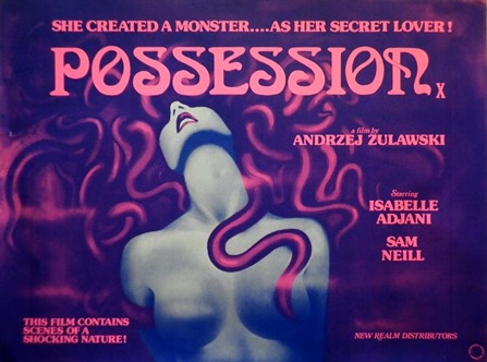
Capturing the golden era of film, Tom Chantrell, had a lifetime of classic artworks. Originally from Manchester, he eventually moved to London, specialising in silk screen printing. Chantrell had a brief change of career when he was called for duty at the Royal Engineers. Here, he designed propaganda wartime effort posters. But it was the 50s, 60s and 70s where his career began to blossom, with posters like Anastasia (1956) and Taste the Blood of Dracula (1969), along with other Hammer titles, becoming a specialist in independent horror/sci-fi/grindhouse/arthouse movie commissions.
Matthew Joseph Peak – Nightmare on Elm Street
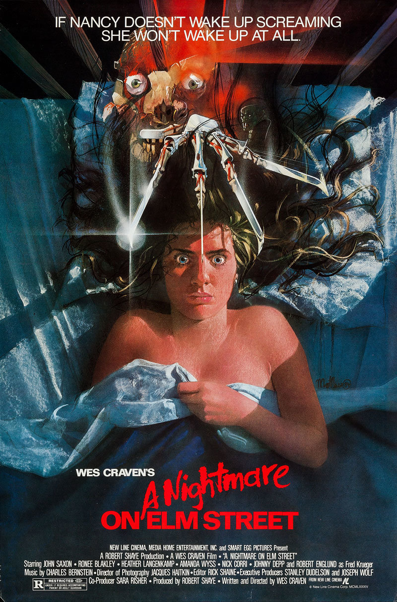
You’ll be able to recognise Matthew Peak’s notable works from classic poster series Nightmare on Elm Street and the Halloween poster, where you can see the image of Michael Myers reflection on the knife.
Art to Matthew Peak was always second nature since his father was a notable illustrator called Bob Peak, known for movie poster work for such classic films as The Dark Crystal and Apocalypse Now.
Peak designed quite a few Nightmare on Elm Street posters, but this is the one I like the most.
Metropolis – Heinz Schulz Nuedamm
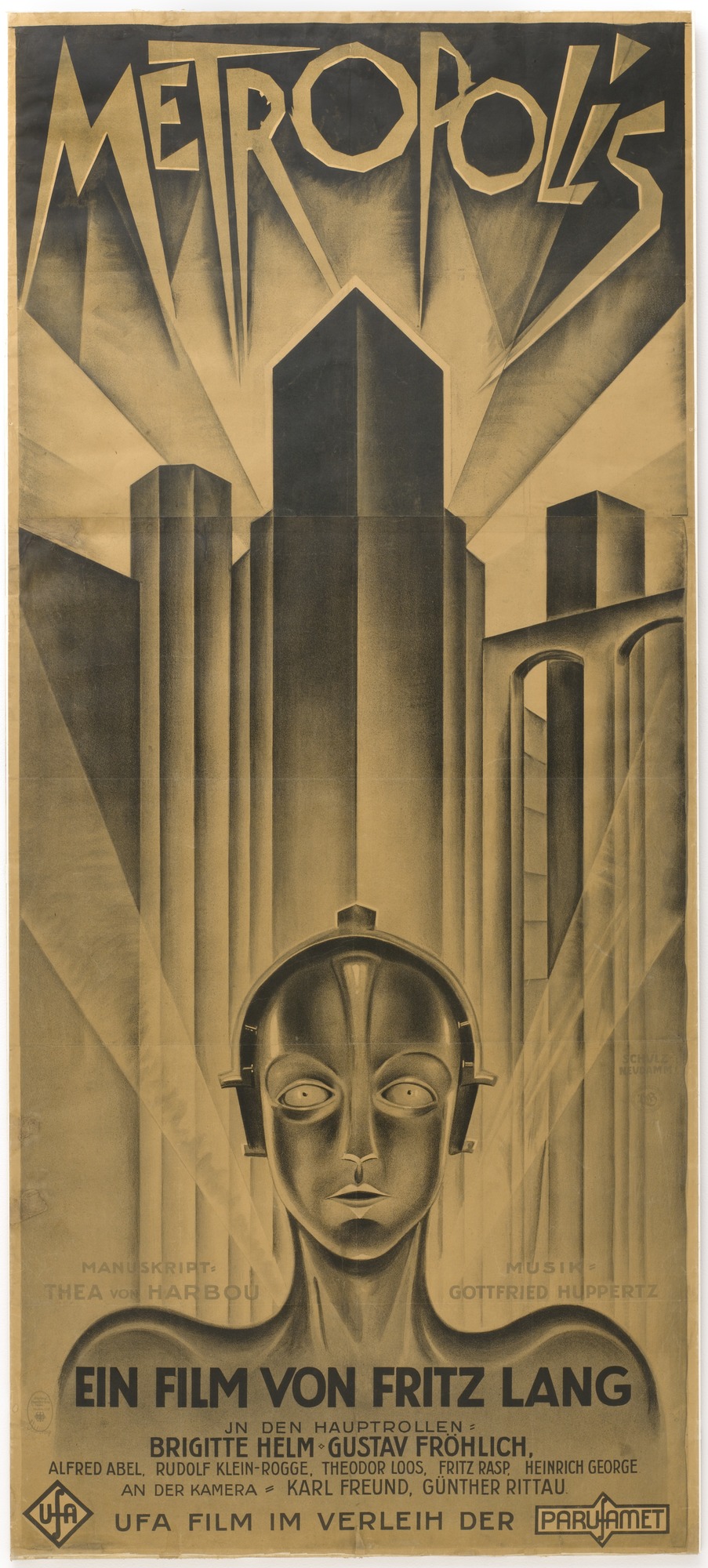
According to Wikipedia, the Metropolis poster is the most high-valued poster of all time.
It was designed by German illustrator and Graphic Artist Heinz Schulz Nuedamm. A spectacularly abstract poster, there’s a deep sense of stark otherness which evokes a feeling of both wonder and fear.
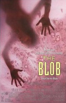
John Alvin Carebears and The Blob

The Carebears Movie terrified me, especially with the wicked witch hologram in the book…
Designed by John Alvin, the Carebears film poster is a great example of the heartfelt sensitivity that comes across in Alvin’s work. A lot of his work is seen as uncredited on IMDB, but I was surprised to see just how many top films he had worked on. There’s also a book called The Art of John Alvin which contains many works people haven’t seen before.
Graham Humphreys – The Stuff and The Evil Dead

Graham Humphreys has a career spanning over forty years in the film poster industry.
Using the unique technique of gouache painting, his illustrations are by far the most recognisable in the world of cinema.
Humphrey’s is known for his works with Palace films, Tartan Asian Extreme and Arrow Film to name a few.
Recently, I managed to speak with Graham where he shared his process behind The Evil Dead poster which was painted in late 1982 for the 1983 release. The illustration took no more than three days, about twenty hours’ worth, although he did make a point to say he would be much faster now.
“I was invited to a screening of the uncut film at the King’s Cross Scala cinema one afternoon (this is where the distributor Palace Pictures, also had their office) – I was the sole audience member,” Graham explains, continuing “The only material I had to work from was a small number of mono publicity stills. I’d formed my poster concept whilst watching the film, produced a single pencil sketch later that day, which was approved after a short meeting and began painting immediately.”
“My original poster did not have the red infill on the title, it was intended to be more ethereal, yellow and white, but it was decided that the addition of red was necessary for clarity. With no specific brief, my inspiration came from 50s B-movie posters and Hammer Horror, but with a punk aggression.”
“The technique I used at the time involved scribbled patches of bright oil pastel forming a base over which the gouache image was painted. Using a scalpel, I could scrape the surface to reveal the bright flashes beneath, giving it a savage texture.
It was all about emulating the feel of the film in paint form, and signalling the horror content. In order to unify the look, I hand painted all the text and credits.
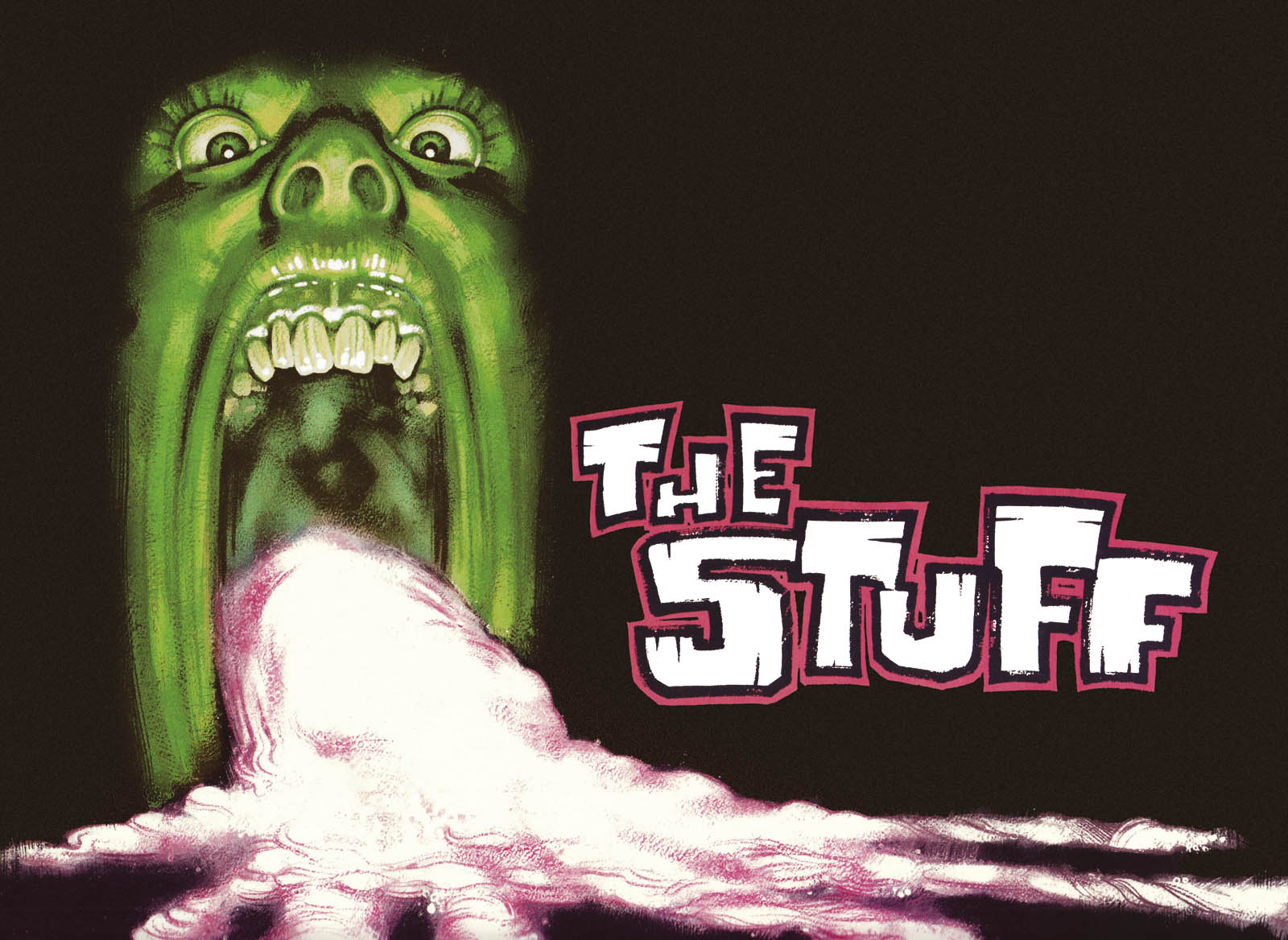
The Stuff was the next poster where Graham was able to share his discipline. And apparently it was the last UK ‘X’ rated horror film.
Designed in 1985, Graham says that it perhaps took no more than eight hours’ worth of solid work and was commissioned by a design agency called Stylo Rouge.
“I had been lent a video copy of the film and a small number of publicity stills. My brief required that the quad poster be adaptable for the video release, thus concentrating on a portrait format, extended to make the quad. I don’t recall a specific brief. Rather than depicting any actual scene from the film, the image was intended to be symbolic. The colours were a direct steal from my Evil Dead art, in order to capitalise on the horror content, yet look cartoonishly humorous. It’s loosely based on my own reflection in a mirror!” Graham divulged further.
“Much like The Evil Dead, there was one sketch, then straight to the painting. I’d abandoned the oil pastel technique by then, it made the painted surface too unstable and liable to flaking. I also designed the title treatment, although the final layout was completed by Stylo Rouge.
As an aside….the designer assigned the job was Mia Matson, then working at Stylo Rouge agency, but soon to head the design studio at The Creative Partnership, where we still work together nearly thirty five years later!”
Graham is currently working on his new up and coming book ‘Hung, Drawn and Executed,’ a follow on from ‘Drawing Blood,’ with over a hundred and twenty new pieces of work. The book is due out this summer.
Rabid Grannies – Troma
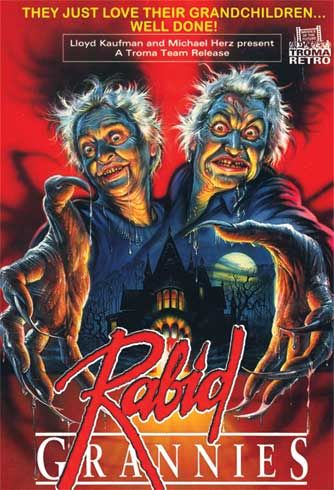
I’ve tried to find out the name of this film poster as it was pretty scary seeing this image on the VHS at the video store! I’ve messaged Lloyd Kaufman, but he’s a very busy man as some of you Troma fans will know. Nonetheless, I still wanted to share this poster because it was iconic for me as a young girl especially as I was always surrounded by elderly people such as my grandmothers church friends all the while.
Thanks for reading all!
Please check out my Instagram/Twitter @Wickergirl666 and my up and coming film Twitter @Frommetoyoufilm and Instagram @from_me_to_you_film.
Categories: art, art exhibitions, Bizarre Stories, Cinema, documentary, events, Film, Horror, horror film, immersive art, Occult, People and Blogs

